The New Media: Looking at the Twitter Behaviour of US House of Representatives Candidates in the Last Two Months of the 2020 General Election
Colin Au Yeung
The 2020 US election was a wildly different election than we’ve had in the past for a myriad of reasons. From the ongoing COVID-19 pandemic continuing to radically how we interact (with voting being no exception) to the highly politically and highly divisive confirmation of a Supreme Court justice mere weeks before the election to the ongoing campaign by the Trump team to proactively discredit the election, the implications of the election will likely be felt and studied for years to come.
However, despite the many important elements of the election, one of the key trends of this election season that fascinates me is the continued importance of social media in the political realm. The power of social media is something that’s been a growing theme for US politics (although definitely not solely US politics) over the last decade. Barack Obama’s monumental win in 2008 is to some degree thanks to Obama’s foresight into the power of then-fledgling social media. In 2016, Donald Trump took the role of social media in politics to a whole new level. His Twitter served not only as a key piece of his campaign but also became a central point for him to communicate to the public throughout the entirety of his presidency. At some points, Trump’s tweets took his administration by surprise and became de facto marching orders for the administration.
That brings us of course to 2020, which is the year the world changed. It’s hard to say how much the lockdowns changed the ways we’ll interact moving forward, but at least for that moment in time, the world was a different place. And the election trail was no different. Massive rallies, door knocking and town halls were relics of the before times (at least for anyone with a concern for people’s lives) and now livestreams and Zoom meetings were the way of communicating with your base. All this puts social media at the forefront of the election.
With this newfound prominence of social media in politics, what I’m curious about is how does social media actually get used during elections? While it’s clear that social media is getting used to support election campaigns, the ways that it’s being used and by who is less clear. Evan, Cordova and Sipole published a paper in 2012 overviewing the strategies that House of Representatives candidates in the US used on Twitter. They do a good job of overviewing the types of tweets that candidates made and the ways they interacted with their bases. This is a good first step at understanding the new frontier of electoral social media, but between the pandemic and the rapid evolution of social media culture, 2012 is a lifetime ago in social media terms.
So my goal in this piece is to get an understanding of what the 2020 electoral landscape is like. To see what we can understand about the election through social media. To do this, I look at the Twitter usage of US House of Representatives candidates in the two months leading up to the 2020 US general election and try to unpack some of the lessons that we can take away from it.
Data Overview
The very first thing that I needed to do was to generate get a dataset of all of the tweets from the US House of Representatives candidates. This ended up taking several steps. The first step was to pull a complete list of candidates who ran in the 2020 election. I did this by pulling Wikipedia’s page on the 2020 general election and scraping the names of candidates, which party they belonged to and where they were running from that page. To ensure its quality, I cross-referenced this list with both Ballotpedia and CNN’s reporting of the election.
From there, the problem was I needed all the Twitter handles of these candidates. Initially, the approach I took was to do fuzzy word searches on Twitter. This did not work well as many candidates had pretty common names that got confused with any number of people. Thankfully, Ballotpedia maintains a relatively complete collection of articles on every candidate in an election in the United States and these articles contain links to the candidate's various social media accounts. In addition, these articles had addresses that are consistently formed based on the candidate’s name. So I used the list of candidates’ names that I had generated from Wikipedia to pull each candidate’s Ballotpedia article. I then used a python library called BeautifulSoup to check for the candidate’s Twitter link and then parse their username from that link.
One of the problems with this is that many candidates have multiple Twitter accounts. For example, Alexandria Ocasio-Cortez has an official Twitter account that’s managed by her office staff as well as a less official Twitter account. I decided that both of these were probably going to be interesting and relevant and so I chose to pull Tweets from all accounts listed for a candidate.
From there I used a python called SNScrape to pull all the tweets from these accounts between the dates of September 3 and November 2, 2020. This gave me a dataset of 164652 tweets.
The information of this dataset is as follows:
- Id - a unique identifier for the tweet
- Name - the name of the candidate
- Username - Twitter handle that the tweet was pulled from. Note that a candidate may have multiple different Twitter handles.
- Message - the text contents of the tweet
- Date - the timestamp of when the tweet was posted
- Retweets, replies, quotes and likes - the number of each of these that the tweet had at the time of scraping
- Hasphoto, hasgif, hasvideo - whether the tweet had a photo, gif or video attached respectively
- ReplyingTo - whether the tweet was a reply to another tweet and who the author of that other tweet is
- MentionedUsers - a list of all users that the tweet mentions
- Hashtags - a list of all hashtags that are used in the tweet
In addition to these fields, I also added several fields from my initial scape of Wikipedia about each candidate
- District - the electoral district that the tweet’s author is running in (for example “CALIFORNIA 1” would be the 1st electoral district of California)
- Incumbent - whether the tweet’s author was the incumbent candidate
- Winner - whether the tweet’s author was the winning candidate in their race
- Party - the political party of the tweet’s author (note third parties were grouped together)
The Analysis
For this data story, I investigate five questions.
- What are the topics that candidates tweet about leading up to the election?
- How are the different modes of interaction (replies, retweets, quote tweets and likes) utilized by users to interact with candidates?
- Does the tweeting behaviour of candidates in competitive electoral districts differ from those in safe districts?
- When are candidates choosing to tweet?
- What is the overall interaction network like for the House of Representatives on Twitter? Who does the House of Representatives interact with on Twitter? Are the central figures or is it more distributed across the nation?
What is the topic that candidates tweet about leading up to the election?
A good starting point for understanding this data is to begin by figuring out just what candidates are talking about in the first place. We have a lot of data, but most of that information is trapped inside the text portion of the tweet. Without gaining some idea of what’s contained in the text of the tweets, we don’t have a good starting point for asking some of our other interesting questions. Understanding the topic matter that candidates are tweeting about provides a solid foundation for our future analysis (besides being interesting in its own right).
To parse out the major topics that candidates were tweeting about, I decided to try and train an LDA topic model on the dataset. For the input for the topic model, rather than using the raw tweets themselves, I ended up both stemming all the words and filtering down the words in the tweets to just nouns and using that as input. While this removes some degree of context from the tweets, given that I’m primarily interested in understanding the broad topics that candidates are tweeting about rather than nuances as to how they are wording their tweets, the loss of that context is likely fine and will overall produce me better results by focusing on the concrete things that they are talking about.
One of the key issues of using an LDA topic model here is that the training needs to know the number of topics it’s looking for beforehand and with this dataset, I didn’t really have a clue as to the number of topics that would be appropriate. The other issue is that training a model on the same input can give me different results on multiple iterations. This means that if I get a model that isn’t particularly good, then it can be hard to tell whether it’s the number of topics that’s the issue or just an unfortunate training. So to attempt to get around these issues in a relatively systematic way, I trained 21 models on the dataset. 3 models each for 5, 10, 15, 20, 25, 30 and 35 topics. These numbers were chosen because I did an initial training on 20 topics and that seemed to give a reasonable model. I then manually compared each of the models until I got a model that I felt provided the best results.
|
|
|
Final LDA Topic Model |
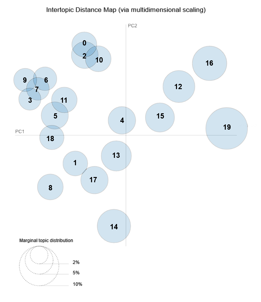
I ended with a final model (shown above) with 20 topics. This seemed to give the best balance between having topics that had a coherent theme and not topics that were so hyper-specific that it became hard to parse as a human.
Now integer labels aren’t super useful, so I went in and generated some human-readable labels. To do this, I looked at the most salient terms for each topic and then cross-check those words with the top 200 tweets that had the highest co-efficient (ie score) for each topic. Let’s take a look at those topics!
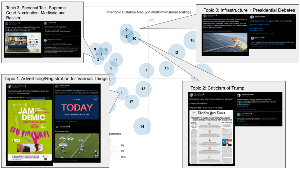
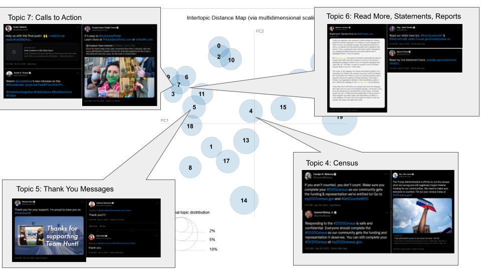
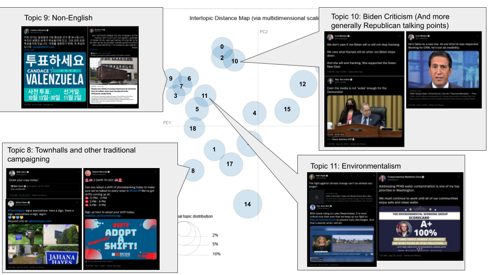
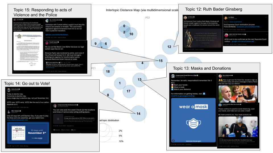
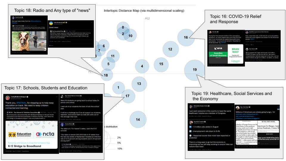
We end up with three broad categories of topics. In the first and largest group of topics, we have topics that are well, genuine topics. For example, we have topics like topic 17 which focuses on education and schools or topic 11 which focuses on environmentalism issues. Second, we have a number of topics that focuses primarily on the means of getting voters involved in the campaign. Topic 8 focuses on recruiting voters to be volunteers or attend town halls, topic 7 primarily tweets that call voters to action, topic 5 is thanking supporters and topic 14 is calling voters to go out and vote. Finally, we have a group which are mostly a grab bag of semi-related tweets which mostly seems like the model failing to categorize. For example topics 1 and 3 while they have vague overarching themes, the tweets within these groups seem relatively unrelated. In addition, we have topic 9 which is mostly just tweets that are not in English.
Overall, I would say that the topics produced by the LDA model are relatively successful. While I doubt what the model has produced is a conclusive list of topics represented in the data set, given that we have well over 100000 tweets, we may have hundreds if not thousands of potential topics. This at least seems like a reasonable group of core topics within our dataset. These topics hit on some of the pillars of political discourse in Western democracies like education, healthcare and environmentalism. As well as some of the key events that occurred over this period of the election like the death of Ruth Bader Ginsburg, the ongoing COVID-19 pandemic and the 2020 census.
|
|
|
Average coefficient for each topic by day |
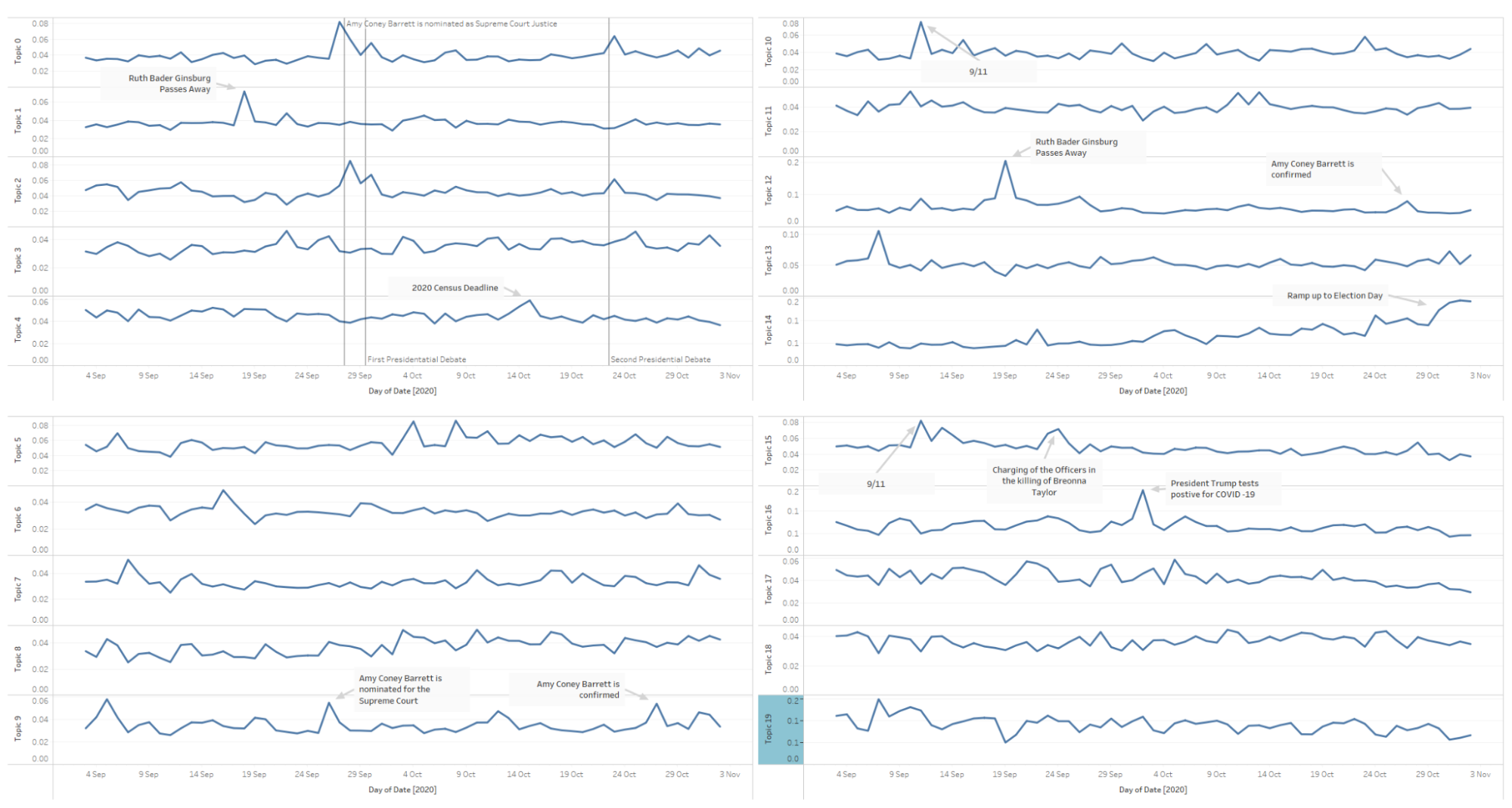
As a sanity check for these topics, I check how the topics compared over the course of the election. What’s really exciting about this is that we can see very clearly some of the key events of the election. For example in topic 1, which focused on the debates and criticism of both Trump and Biden, and topic 2, which focuses on just criticism of Trump, we can see spikes right around the two presidential debates. On the other hand in topic 12, which focuses on the death of Ruth Bader Ginsberg, we see the spike where she died, but also a spike when Amy Coney Barrett was confirmed for her seat. The fact that the topics reflect the events that we would expect them to help to confirm that the topics produced by the model are in fact meaningful.
To conclude this section, we managed to train an LDA model which generated topics that seem to accurately reflect some of the core topics that candidates tweeted about during the election.
How are the different modes of interaction utilized by users to interact with candidates?
Move a little away from the candidates themselves, the next thing I was curious about was how other users interact with them. Twitter provides four basic ways of interacting with other people’s tweets. Firstly, likes are the means of saying that you like a given tweet. Next, you have retweets which are a means of spreading a tweet if you like it. Replies exist for people to engage in conversation around a tweet. Finally, you have quote tweets which are like retweets but with the quoter giving additional context. Each of these mechanisms for interaction has slightly different usage as well as affordances within the Twitter ecosystem. I’m curious about how these different mechanisms get used to interact with candidates.
In order to start to see how users use these in relation to candidates, I began by plotting a scatterplot matrix of the number of each interaction type a tweet received.
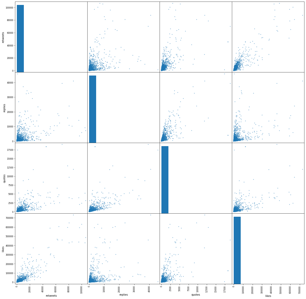
From this, we can start to see some relationships, although they become clearer when we convert this into a correlation matrix (shown below).
|
|
|
Correlation matrix of retweets, replies, quotes and like |
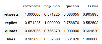
From this we can see that there seem to be two pairs of interactions that correlate with each other. Likes and retweets strongly correlate together, whereas quotes and replies relatively strongly correlate together. This seems to make some sense as likes and retweets are relatively low investment ways of interacting with tweets as in both liking and retweeting a tweet involve a single button press. In both cases, they also both roughly send the signal that you agree with the tweet because you’re sharing it without any other context. Replies and quotes on other hand require more investment as they require you to send your own message in response. The additional context of these interactions also always allows users to more readily disagree with tweets. Thus these relationships make sense, but now the question is can we explain which tweets get more of one type of interaction over the other.
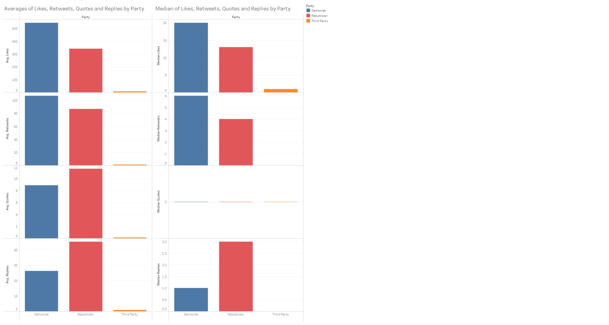
Here I have plotted the average and medium amounts of likes, retweets, quotes and replies that a tweet gets broken up by party. What’s fascinating is that immediately we see that replies as an interaction type are more prevalent on Republican tweets than Democratic tweets (quote tweets by extension, however, most tweets seem to get so few quote tweets it’s hard to draw any conclusions). This still begs the question of why Republican tweets get more replies than their Democratic counterparts.
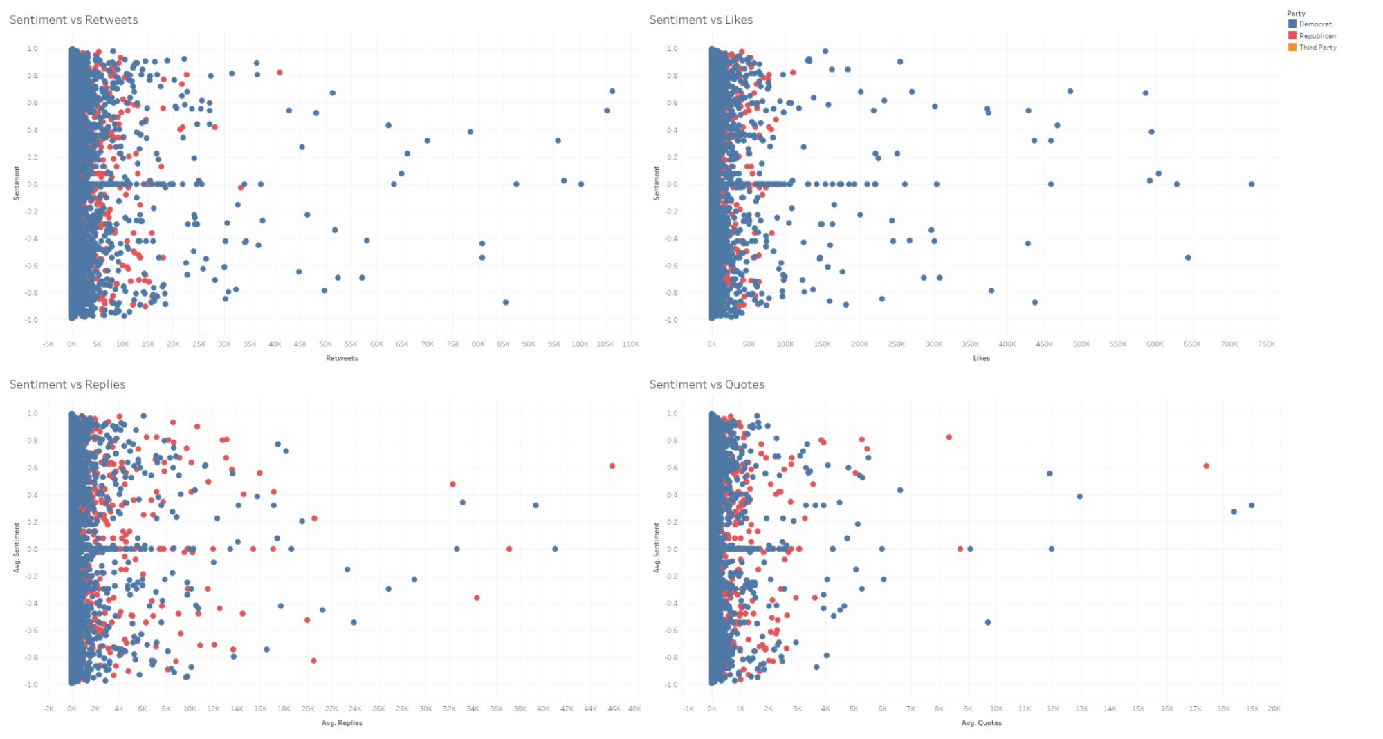
My first thought was that maybe Republican tweets were more negative in nature and drew in more angry replies or something to that effect. So I plotted each interaction type against sentiment (shown above). But that doesn’t seem to be the case. Tweets that get a lot of replies or quotes don’t seem to be any more negative than tweets that get a lot of likes or retweets. So that largely roles out the theory that it’s because of the sentiment of Republican tweets vs Democratic tweets.
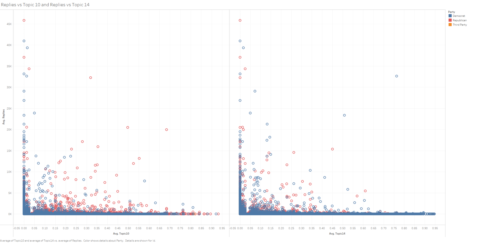
The next place I looked for an explanation was the topics that each party tweet about. Here I have plotted the coefficients of Topic 10 and Topic 14 from my earlier analysis against the number of replies a tweet gets. Topic 10 and 14 were the topics that lean most strongly towards Republicans and Democrats respectively. Here we do see a slight difference. Topic 10, which focuses on criticism of Biden, does seem to correlate more with the number of replies that post gets. However, it seems like a rather small effect and especially given that Topic 14 tweets mostly just asked to remember to vote, which by its nature is less interactive. However, this may just as likely be a result of another confounding variable as well. It may simply be a result that something else is causing Republicans to get a lot of replies and since Republicans get a lot of replies than tweets that have high coefficients with Topic 10 which is dominated by republicans also get a lot of replies.
Another theory that I don’t have the data to test is that in part this may be a result of the way different demographics utilize tweets. For example, while using likes and retweets are the norm for showing support for tweets on Twitter, that isn’t necessarily true of all social media platforms. On Facebook, leaving a short comment is an acceptable way of showing your support of a post. Then it may be conceivable that if Republican candidates were more likely to have a base that either spends more time on Facebook or has migrated from Facebook, then this norm difference may play a factor.
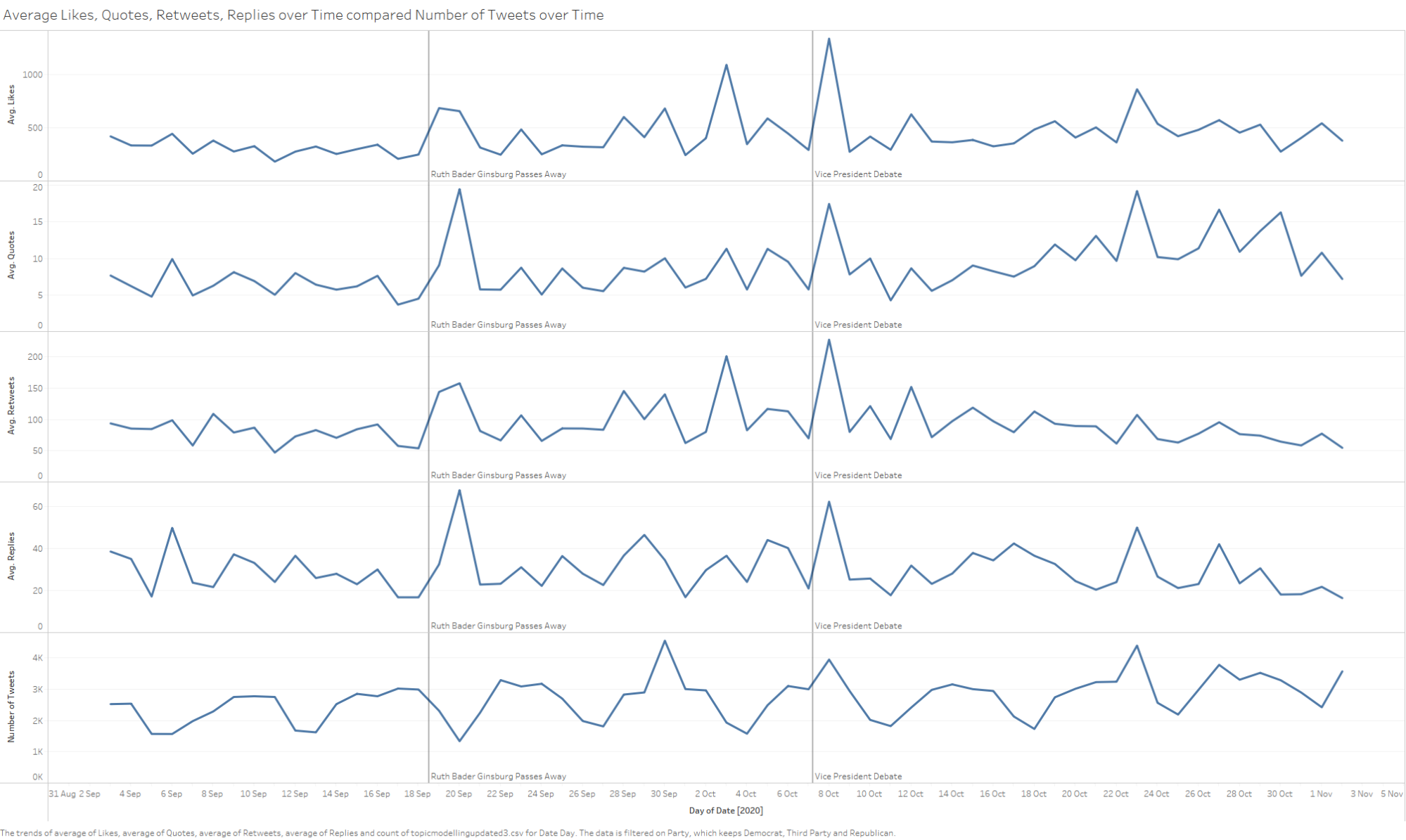
A final interesting note that I wanted to include here is a look at Twitter interactions with candidates over time. Here I’m plotting the average amount of likes, retweets, quotes and replies that candidates’ tweets are getting per day and comparing them to the number of tweets being made per day on the bottom. What’s really interesting here is it seems like the events that are driving interaction aren’t necessarily what candidates are tweeting the most about. For example, we see a big spike in responses to candidates' tweets when Ruth Bader Ginsberg passed away. In this case, it’s likely a large amount of response to a smaller number of memorial tweets to her. Far more interestingly, we see a huge spike of responses to the vice presidential debate. This is weird since usually, it plays second fiddle to the presidental debates and we see that in the number of tweets that candidates make. But the response to the vice presidential debate far outstrips the presidential debate. There might be a number of responses to this. One reason might be that there was more emphasis on Kamala Harris as Biden’s running mate this year. Given Biden’s age, people considered it a real possibility that Harris might need to step in as president if elected. Although I think the more probable reason for this spike of attention to the debate was the incident with a fly on Vice President Mike Pence’s head that had become an internet meme and thus was driving interaction.
To conclude this section, the data suggests that the way that users differ in their usage of Twitter’s different interaction modalities towards House of Representatives candidates is that they are more likely to like and retweet Democratic candidates and more likely to reply to a Republican candidate.
Does the tweeting behaviour of candidates in competitive electoral districts differ from those in safe districts?
Given how hard it is to flip a seat in the US federal elections, the next thing that I wondered about is whether candidates in more competitive electoral districts had different strategies to campaign than their counterparts in safer districts. One of the challenges with this question is defining what a competitive seat is.
The first metric I used was the previous result of general elections in a given electoral district. To get this data, I polled the MIT Elections Data Science Lab’s data on US House elections from 1976-2020 to get the election results from the previous 3 general elections (2012, 2016, 2020) in each district. I chose these years because these were the general elections which occurred under the electoral districts drawn from the 2010 census. Choosing a general election was important since while the full House of Representatives goes to elections during midterm elections, typically the midterm elections have lower turnout which may lead these elections to have different voter dynamics. Then choosing elections that occurred using the electoral boundaries drawn under the 2010 census was important to ensure that the electoral district would be the same throughout these elections and thus comparison between years in these districts would be valid. From this data, I calculated the average percentage that the winning candidate won across those three elections for each district. Shown below is the distribution of those values.
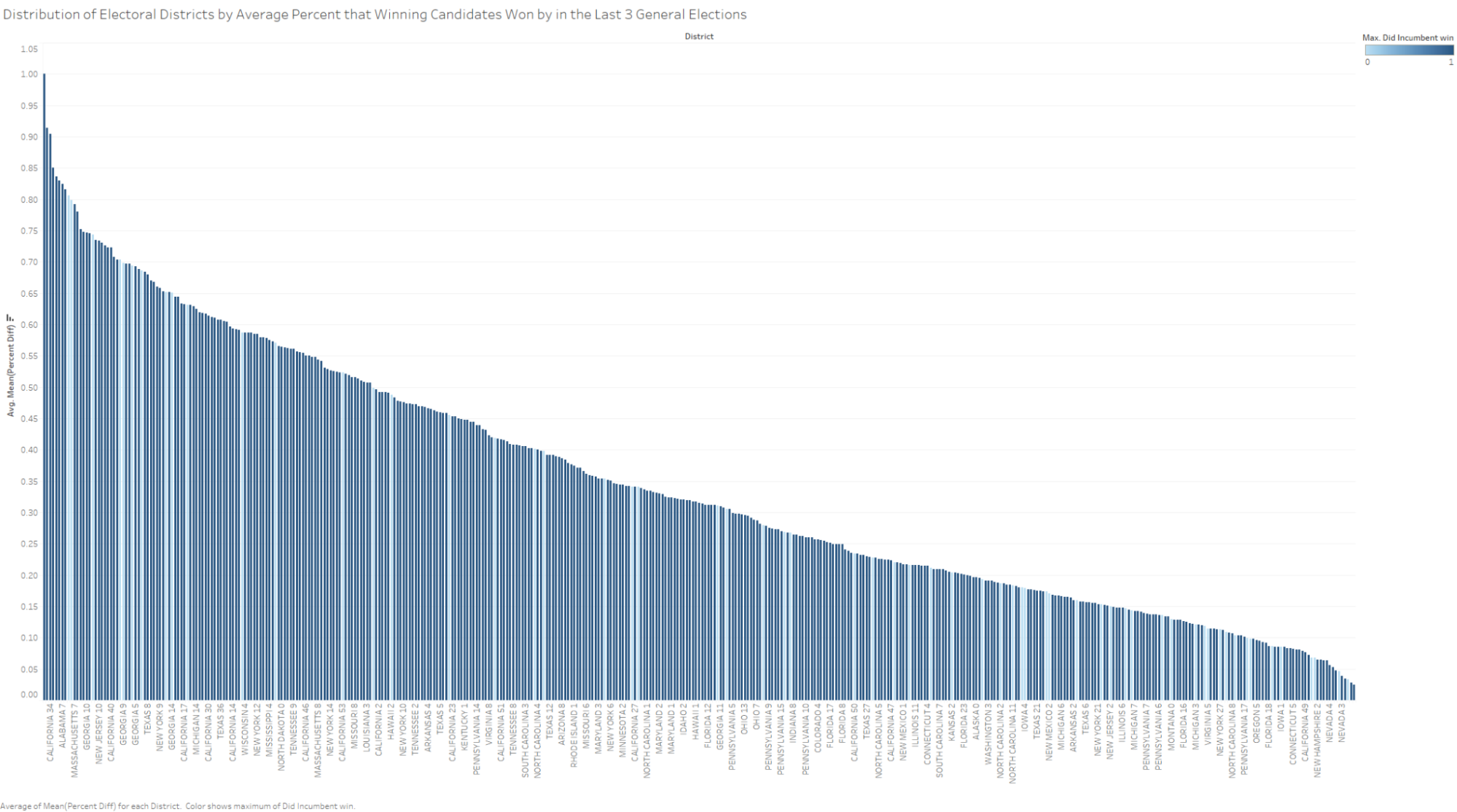
Highlighted in light blue are districts where an incumbent candidate did not win. This gives us an initial sense of which districts actually turn out to be competitive. Here we can see the issue with this past elections metric. Districts that turn out to be actually competitive seem to be distributed relatively equally across the entire dataset and thus we don’t have any good cut-off measure for estimating competitiveness. This does make sense given that if we have a district that is consistently won by say 10 points, this isn’t going to be any more competitive than say a district consistently won by 20 points.
The next metric I tested was to look at FiveThirtyEight’s predicted percent chance of each candidate winning a district. I manually parsed their forecasting model for the 2020 election and recorded how confident they were that their projected winning candidate was going to win for each district. Shown below is the distribution of those values.
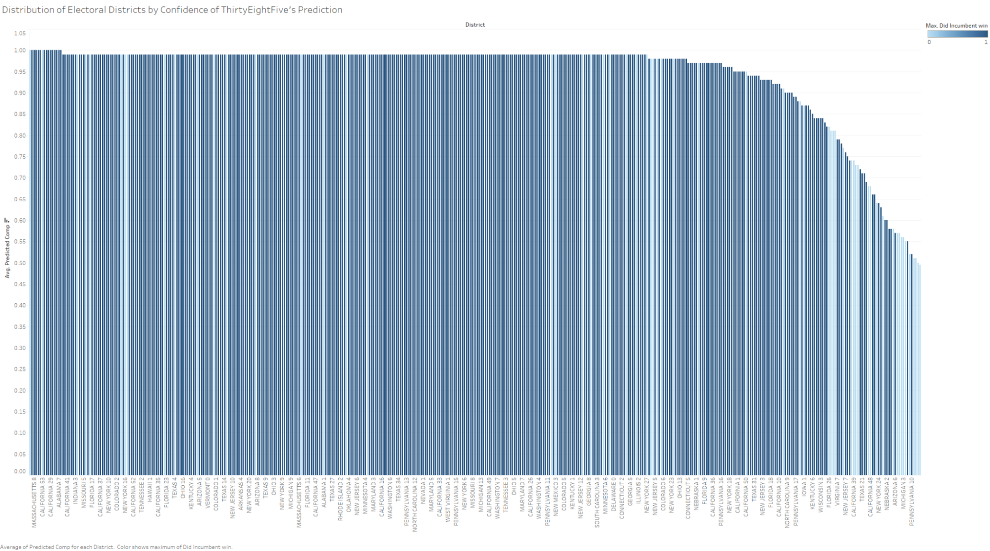
Once again highlighted in light blue are districts where an incumbent candidate did not win. This on the other hand gives us a much nicer distribution of actually contested districts. While there are still a few contested districts spread throughout the data, we see a nice concentration of them down in the districts that FiveThirtyEight is less confident in. This gives us a nice cutoff value when FiveThirtyEight is 84% confident at their projected winner will win to judge whether a district is competitive or not.
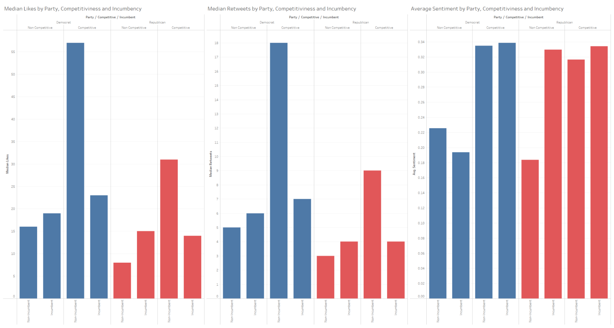
Given this metric of competitiveness, how do candidates in competitive districts differ from, their non-competitive counterparts? Unfortunately for me, they don’t seem to vary much from their non-competitive counterparts. In terms of both tweet length and topics that they tweet about, they were no different enough from their counterparts to say that there was a definitive difference between just noise. However, one really interesting result is that on average tweets from candidates in competitive districts were more positive than their counterparts. This is kind of counterintuitive given that you would expect candidates in highly competitive races would be more competitive with their opponents and thus more likely to post negativity about their opponent, but that does not seem to be the case here. Instead, the competitive district leans itself more to more positive tweets. One explanation for this might be that in competitive districts, candidates have to spend more time appealing to their potential voters whereas, in safer districts, candidates have more freedom to go after the opposing party at the presidential level or even in other districts to support the overall party’s chance of winning.
Another interesting detail is candidates in competitive rides seem to get greater support on Twitter than their non-competitve counterparts with them getting more median likes and retweets on a given tweet than their counterparts. This might be explained by that their supporters might be more inclined to show their support to these candidates on the edge of the election.
When are candidates choosing to tweet?
Another question I was interested in is whether candidates are taking any particular strategies as to when they’re tweeting. Given Twitter’s fast-moving timeline and the limited visibility of tweets far past their time of posting, one might suspect there are optimal times to tweet in order to maximise the attention that your tweet will get. I wondered if candidates are taking advantage of strategies to maximise the visibility of their tweets.
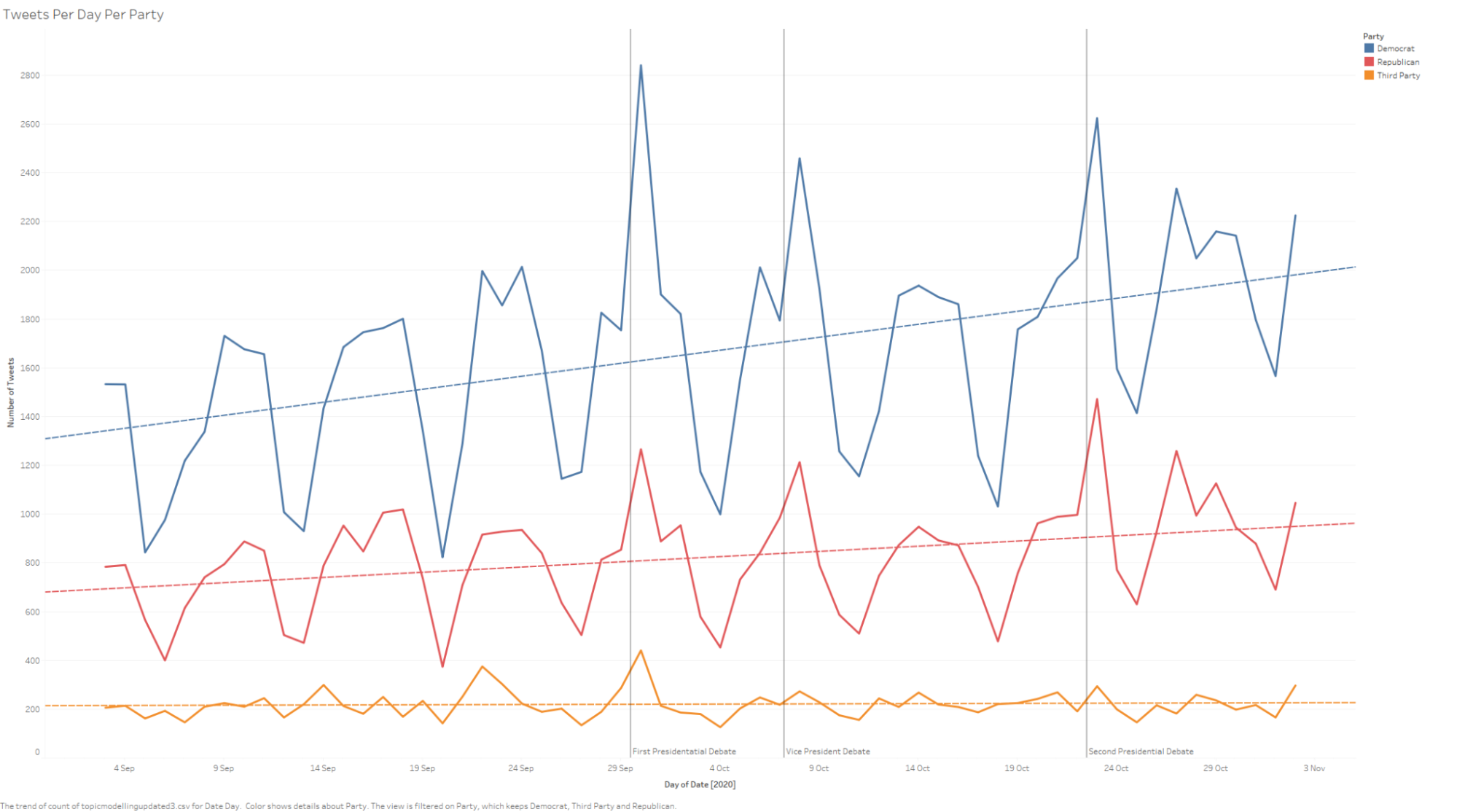
In this plot, I am displaying just the raw number of tweets from each day of the dataset, broken up into their respective parties. What’s immediately striking is the periodicity of the tweets. This suggests that there is some regularity with which candidates tweet. While some of this periodicity seems to be explained by both the Presidential and Vice Presidential debates which unsurprisingly would garner a high degree of attention, this doesn’t necessarily explain the rest of the periodicity.
|
|
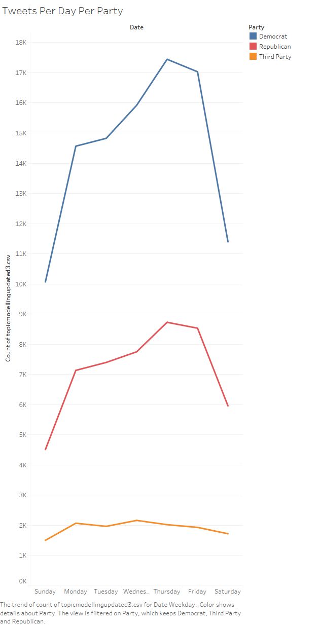
Ah ha! In this plot, I’m plotting which days of the week that tweets got posted, once again broken down by party. Here we can now see where that periodicity was coming from. In this case, we see that candidates primarily post on Thursday and Friday with sharp drop-offs on the weekend.
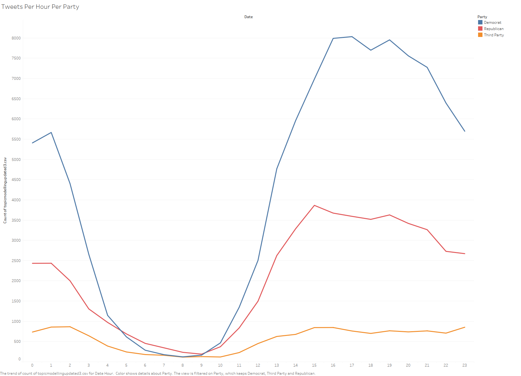
If we break it even farther, this time plotting which hours get the most tweets, we can see that candidates tend to post from about 10am to around 10pm (although this window shifted due to timezones).
What’s interesting about this posting pattern is that it suggests that candidates are primarily posting during workdays. This is strange from an intuitive perspective as this doesn’t seem like an optimal timing for tweet visibility given that these are likely the days that people are going to be working. If one was going to target times when more users would see tweets, one would likely choose to tweet more often on the weekends. Although this might be compensated for the fact they do seem to tweet more frequently into the evenings when people are getting off work and thus might be checking their phones for the day.
It’s hard to say whether these are intentional choices or not. While they may be intentionally targeting the evenings as people are getting off work and checking their phones, this may just as likely be a result of the hours that the candidates themselves have to tweet. It’s definitely fascinating that these trends seem to hold across the different parties (and not shown here also competitive vs non-competitive races). I would be curious to compare this data to overall Twitter data to see if these patterns are simply the product of when people are active on Twitter (and by extension their phones) which would explain why it seems so consistent across groups.
What is the overall interaction network like for the House of Representatives on Twitter? Who does the House of Representatives interact with on Twitter? Are the central figures or is it more distributed across the nation?
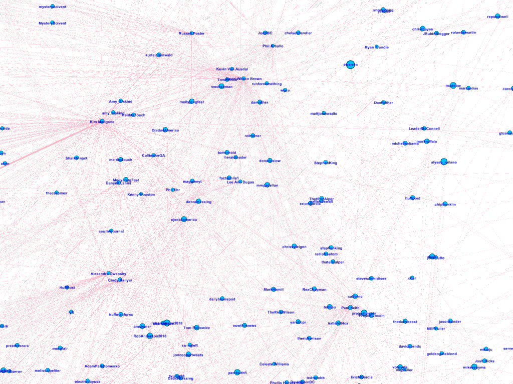
The final question was to step back away from the dataset as tweets and observe it as a social network. I was curious as to the structure of this Twitter ecosystem that surrounds these House of Representatives candidates. To do this, I began by defining a network from my tweet dataset. I did this by defining the nodes to be Twitter users and if they were candidates from my dataset, then I combined their different accounts as a single node. Then the network would be a directed graph such an edge would start from a House of Representative candidate and go to any user that they either mentioned in their tweet or that they replied to. The weight of that is how many times they either mentioned that user or replied to them. In order to contain the scope of this dataset, I then limited the graph to users that a candidate in my dataset mentioned at least twice. The result of this is a huge network shown below.
You can also explore the network yourself: https://colinauyeung.github.io/test/embed.html
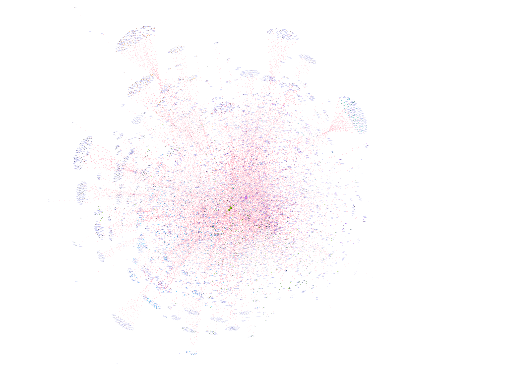
There are a number of encodings on this network, albeit hard to see at this view. First, the size of the nodes represents the eigenvector centrality of the node. The second is that colour of each node represents the modularity class that it was calculated to belong to. While this network is hard to look at initially, there are some structures within the network that are interesting to examine.
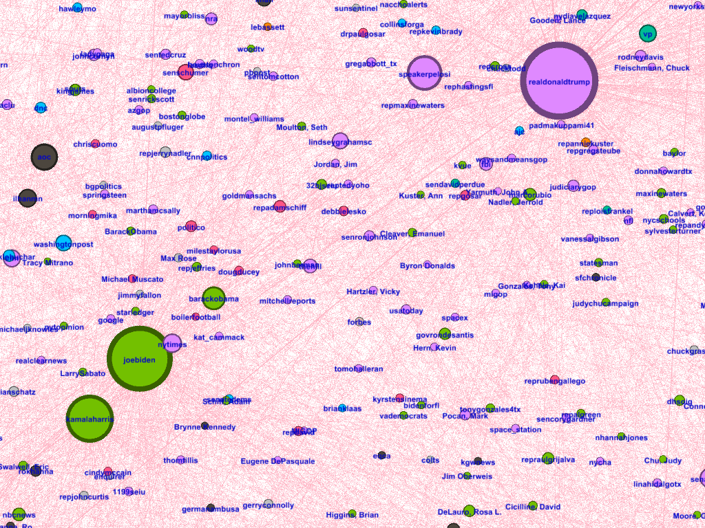
The first notable structure of the network is that at the center of the network with high centrality, we find the two presidential candidates alongside a number of key central figures of the federal government such as Kamala Harris, Barack Obama and Speaker Nancy Pelosi. Their high centrality in the network suggests that ultimately like with traditional media, the presidential election is still the dominant force of the general election and that the campaign of many candidates is still predicated to some degree on the presidential candidate of their party.
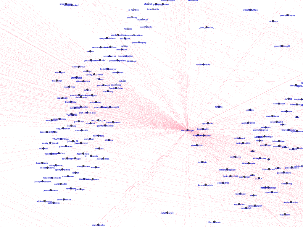
The second interesting feature is the star-like clusters of users that form around candidates. Given the number and size of these “plumes”, what this seems to suggest is that despite the centralization around the presidential election on Twitter, candidates are still behaving in the manner of representatives. They are still acting as touchpoints for voters to reach out to and are still actively engaged in conversation with them.
This puts the network in an interesting light. Candidates on Twitter are in some way acting as intermediaries between the presidential election and the average voter. Their campaigns still seem to be deeply connected to the broader picture represented by the presidential race, but also seem to be actively engaged with their own communities.
Now in terms of the modularity classifier, it also brought up some interesting insights into the network.
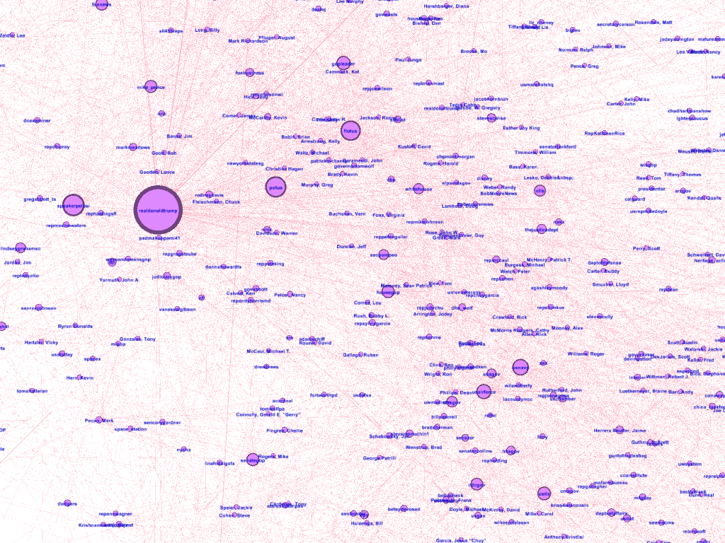
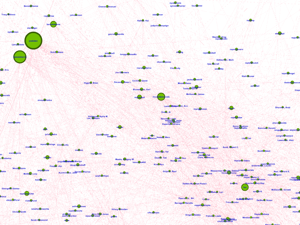
First off, as shown above, unsurprisingly two of the major classes are centred around the presidential candidates of each party. Although are some oddities such as Nancy Pelosi falling into the same class as Donald Trump, as a whole they seem to be fairly representative of the parties with some exceptions.
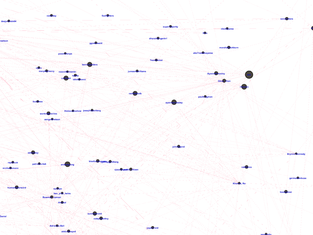
The exceptions seem to be on the democratic party side. As shown above, we have large communities that are part of the democratic party. Firstly, we have the teal community which seems consistent of a number of Democratic challengers. Interesting within this relatively large community, there aren’t necessarily figurehead candidates that it’s centred around. On the other hand, we have the black democratic community. This one is a little more understood as it’s centred around the more progressive wing of the democratic party in the form of Bernie Sanders, Alexandria Ocasio-Cortez and Andrew Yang. Taken together, this might represent an interesting division within the Democratic party.
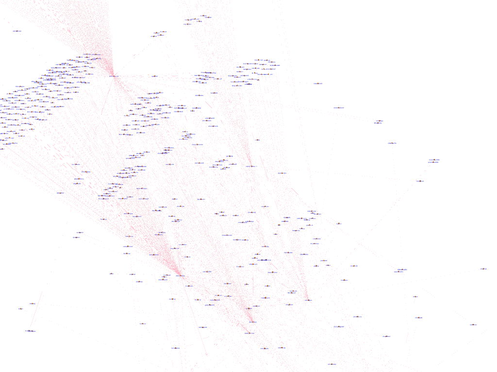
Finally, we have a community of Libertarian candidates.
To conclude this section, the network of House of Congress Representative’s Twitter activity still seems to be centred around the Presidental election, but candidates still actively engage with their base.
Conclusion
While much of my analysis doesn’t have definitely conclusions, here are some key take-aways:
- LDA Model does seem effective at detecting topics within the corpus of tweets from House of Representative candidates and the topics it found are traditional cornerstones of political discourse and campaigning
- Twitter users are more likely to like and retweet tweets from Democratic candidates and more like to reply to Republican candidates, although the exact reason for this effect is unclear
- Despite the intuition, candidates in more competitive ridings are actually more like to make positive tweets than their counterparts
- Candidates tend to tweet on Thursday and Friday from 10am to around 10pm. However, the presidential debates are central moments that candidates will tweet around.
- Network of House of Congress Representative’s Twitter activity still seems to be centred around the Presidental election, but candidates still actively engage with their base
- Network of House of Congress Representative’s Twitter activity also seems to reflect the fractures within the Democratic party
Thanks all for now folks! Thank you so much for reading!